
The Casually Cruel Absurdity Of Blank Dashboard Gauges
Screenshot: eBay I think with modern LCD instrument clusters steadily becoming the default choice for

I think with modern LCD instrument clusters steadily becoming the default choice for most cars, what I want to talk about today is something that is well on its way to extinction. Objectively, this isn’t a bad thing, as what I’m talking about are things that have no actual use or purpose beyond reminding a car’s owner of something they do not have. They’re devices that perform the opposite of a function, somehow. I’m talking about the empty Gauges of Nothingness used on car instrument clusters.
You know the ones I’m talking about: When a carmaker designs an instrument cluster, often they would make sure it could accommodate the full possible spectrum of instruments and gauges possible for the ideal, full expression of that given car.
That means for people who bought cheaper versions that lacked some of these instruments or gauges, there would be holes that needed to be filled, since most buyers, even ones looking for cheap cars, aren’t cool with yawning chasms full of wires just staring at them behind the steering wheel.
So to fill these holes, the Gauge of Nothingness was born.
I think what I find so fascinating about these is that nearly all of them are designed so that they emulate the look of a dashboard gauge even though they do nothing.
G/O Media may get a commission
The way this usually is achieved is by mimicking the hash marks and calibration lines of an instrument that could actually show you something, and the result, I think, is far weirder than if they just put in some blank panel.
Here, let’s look at some of these:

That’s a late ’60s Chevy Nova, and in between the speedometer and that combination fuel gauge/idiot light cluster sits what looks like a 1/10th scale model of a Chevy hubcap set into what looks like a crosshair reticle. Maybe that’s the instrument that helps you shoot hubcaps from inside your car.
Chevy was very fond of these Void Indicators, and later versions of the Nova had some really top-notch empty gauges:

These are from a 1978 Nova, and what’s amazing here is how GM’s designers seemed to think that there should be no space on this dashboard whatsoever that didn’t at least pretend to be a gauge of some kind.
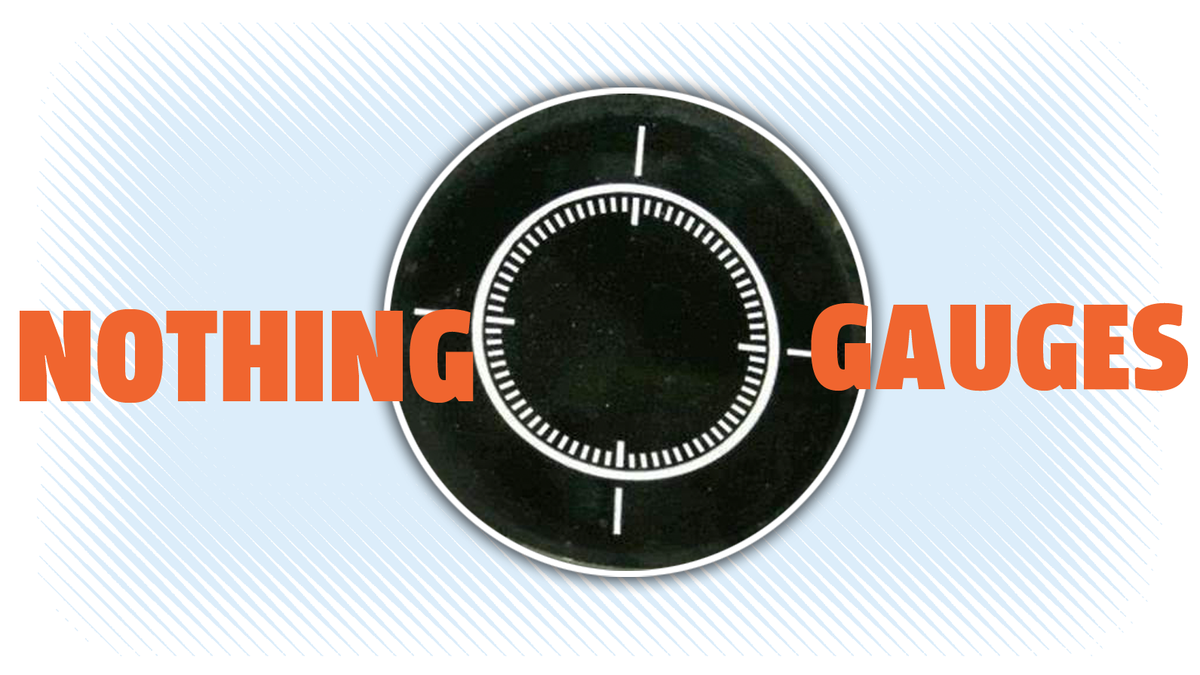
Inside the two idiot light clusters at each end are fake, empty gauges in the center, with the one on the right being especially incredible at measuring nothing, because it has two concentric rings of hash marks in differing degrees of demarcation to really, really display exactly how much nothing you’re dealing with at any given moment, down to like 1/200th of a nothing.
It wasn’t just the Americans getting into the meaningless gauge quest, even though we excelled at it. Here’s a Brazilian-market Volkswagen Brasilia, displaying a literally timeless no-clock fake gauge on the right, which I assume is some sort of Eternity Clock:

I’d like to think it was going to be a clock, but then someone broke out the hallucinogens. By the time they finalized the design the concept of “time” had lost all meaning to everyone involved, so this was the only rational option.

Sometimes they would stick the car’s logo and name in the blank spot, but even when they do that they just can’t help but sticking in some fake hash marks as well, like this non-clock design on the Nova panel.
This one does feel kind of like a little burst, though, and if you think of the meaning of “nova,” as in an exploding star, then it’s like a cute cartoon POP of a star going nova.
My favorite one of these, though, has to be this, from an AMC Hornet:

Let’s take a moment and consider the leftmost gauge there. In size, it’s commanding a good 33 percent of this whole instrument cluster. It’s easily six times the size of either the fuel or temperature gauges, arguably two of the most important gauges on the car. It’s the same size as the speedometer.
And what’s in this gauge? A calligraphic flourish, centered, surrounded by a squared-off ring containing 24 hash marks. It looks kind of like something you might see on cookware, or a toaster made in 1976.
I mean, I assumed the gauge does nothing, but perhaps it actually is a gauge to detect any nearby calligraphic flourishes, which it can measure on a scale of 1 to 24 for intensity of flourish.
Even if you were some kind of Rockefeller and spent the money to have your calligraphic flourish instrument replaced with a bleeding-edge digital clock, that setup looked like this:

That’s still a hell of a lot of real estate to be given over to that one tiny clock, floating there in that black plastic void, and this approach brings me to another related phenomenon when it comes to filling space on a dashboard: absurdly and needlessly oversized instruments.
The best example I could think of is on early 1980s Chrysler K-Cars. Here, look at this dashboard from a Dodge Ares:

There was a large amount of area to fill, but Chrysler was only going to stick a speedo, fuel gauge and seven lights on there. That’s not a lot. A number of cars crammed all of that into a solitary round instrument cluster with no problem.
But Chrysler had this very wide expanse to fill, so what did they do? They made all of the little warning lights these huge square panels, all the same size, so the turn signal arrows got the same generous plot of acreage as the wildly ambiguous “engine” light.
Oh, I guess the high beams got a little screwed, relegated to the median between the speedo and fuel gauge. That fuel gauge is also worth mentioning, because it has two dummy hash mark scales on the sides that mimic the fuel gauge but do absolutely nothing.
I think it’s possible this instrument panel has the largest ratio of turn indicator area to overall instrument size, with the two arrows commanding about 15 percent of the whole cluster.
All these gauges ever did was give frugal owners a bit of a kick to remind them that they’ve been denied some better reality, and for that reason they’re sort of cruel. But they were also a bit whimsical and idiotic, two traits dear to me, so I think overall I’ll miss them.
I guess the good news is that with modern LCD displays, I could, potentially custom-configure a dashboard to contain nothing but calligraphic flourish indicators.
That’d be living, right there.
(Thanks for reminding me of these, Hans!)